New Brand Identity
& Packaging - Factiv

Expertises

Brand Identity
Packaging Design

Background

Factiv is a science-based skincare brand founded in Hong Kong that prioritises evidence-based formulations and effective product results. It staunchly advocates for a rational approach to skincare, opposing the impulse-driven marketing trends prevalent in the industry, and offers consumers only proven facts and verifiable efficacy without flowery promises.

Challenge & Solution

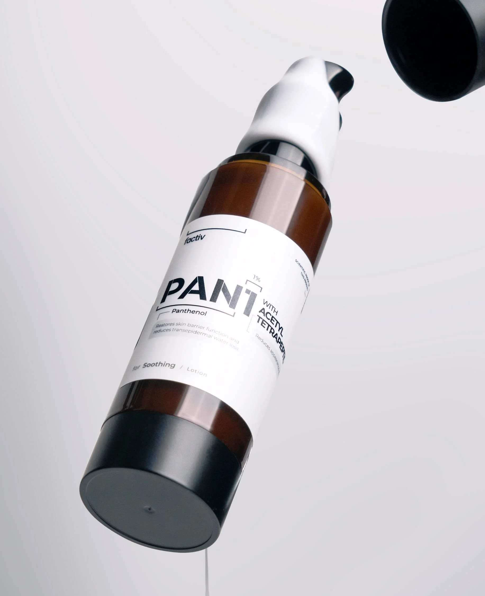
My role was to create an integrated visual identity and packaging that reflects brand’s dedication to scientific rigour and functionality, setting it apart in the fanciful cosmetic market. To visualise such ambitious brand image, I first pinned down key adjectives that encapsulate the brand’s essence: Clean, Scientific, Rational and Functional, which naturally led to a minimalistic and modern aesthetic approach.

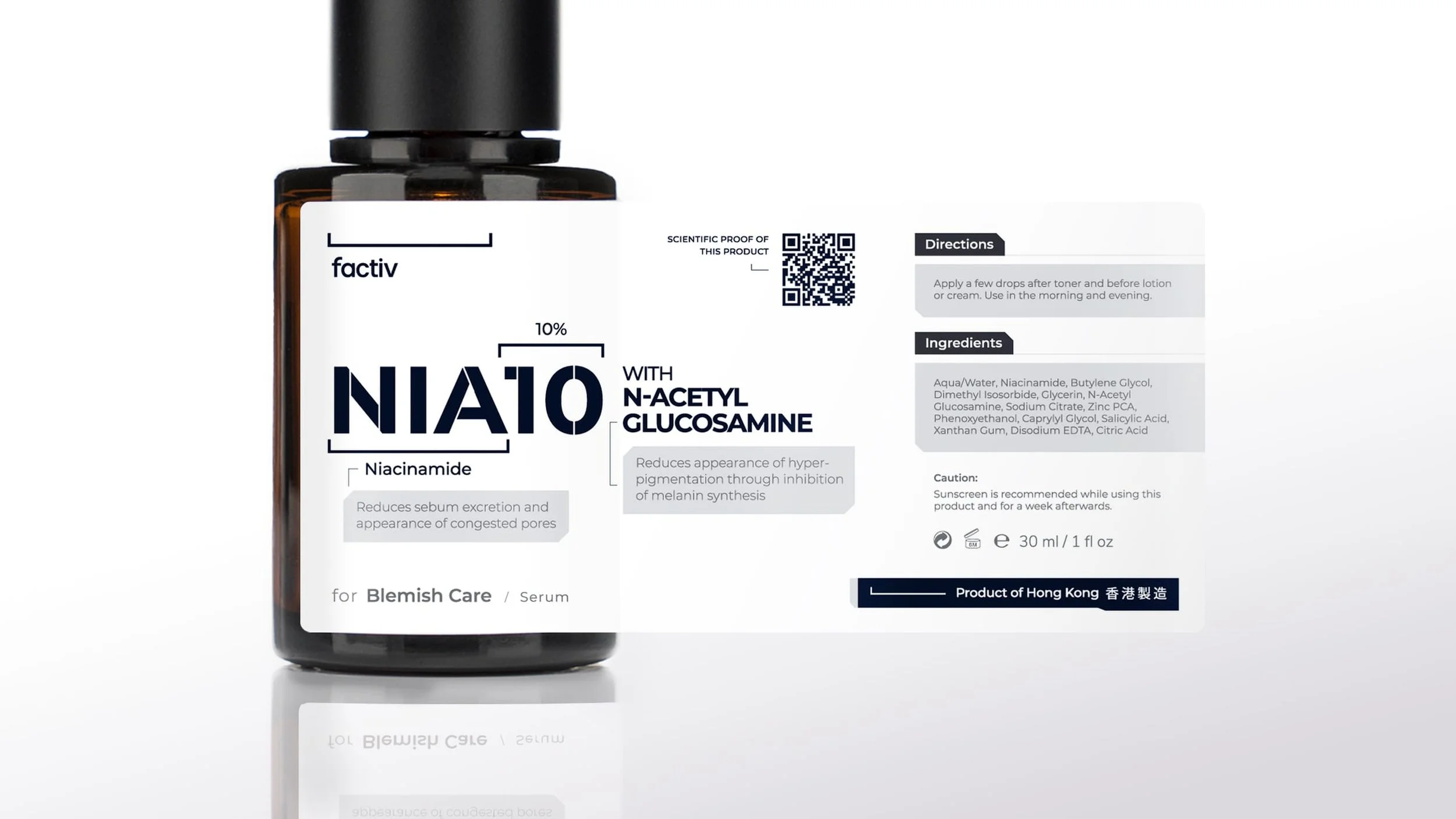
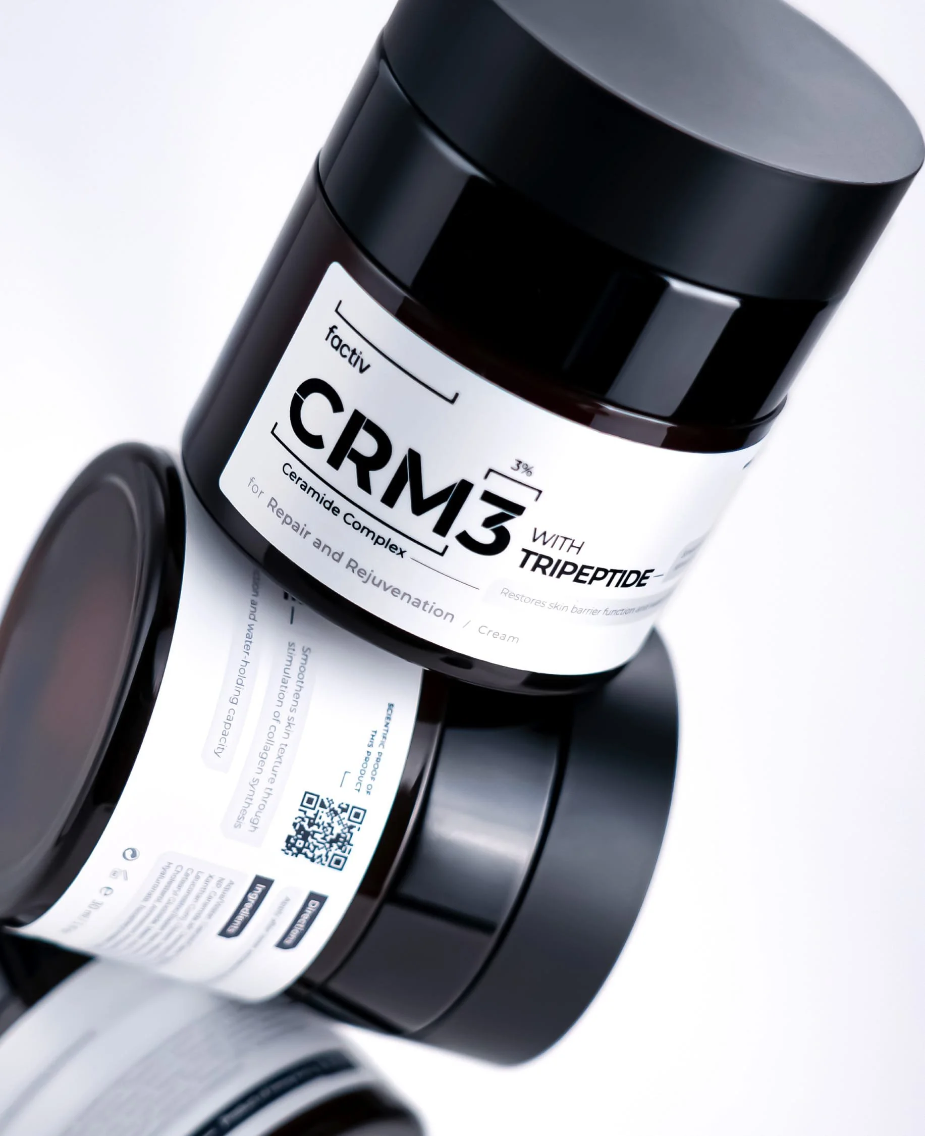
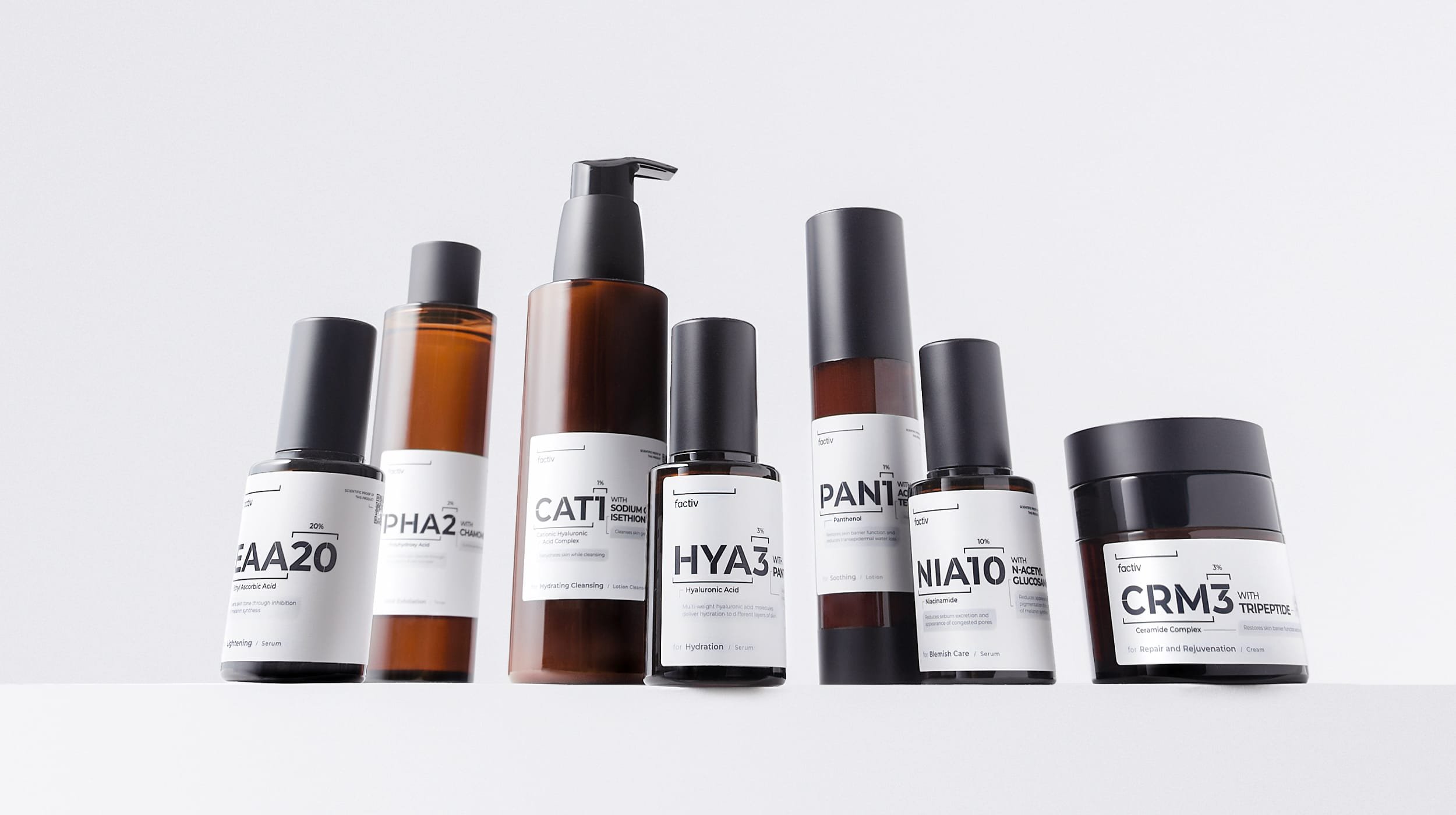
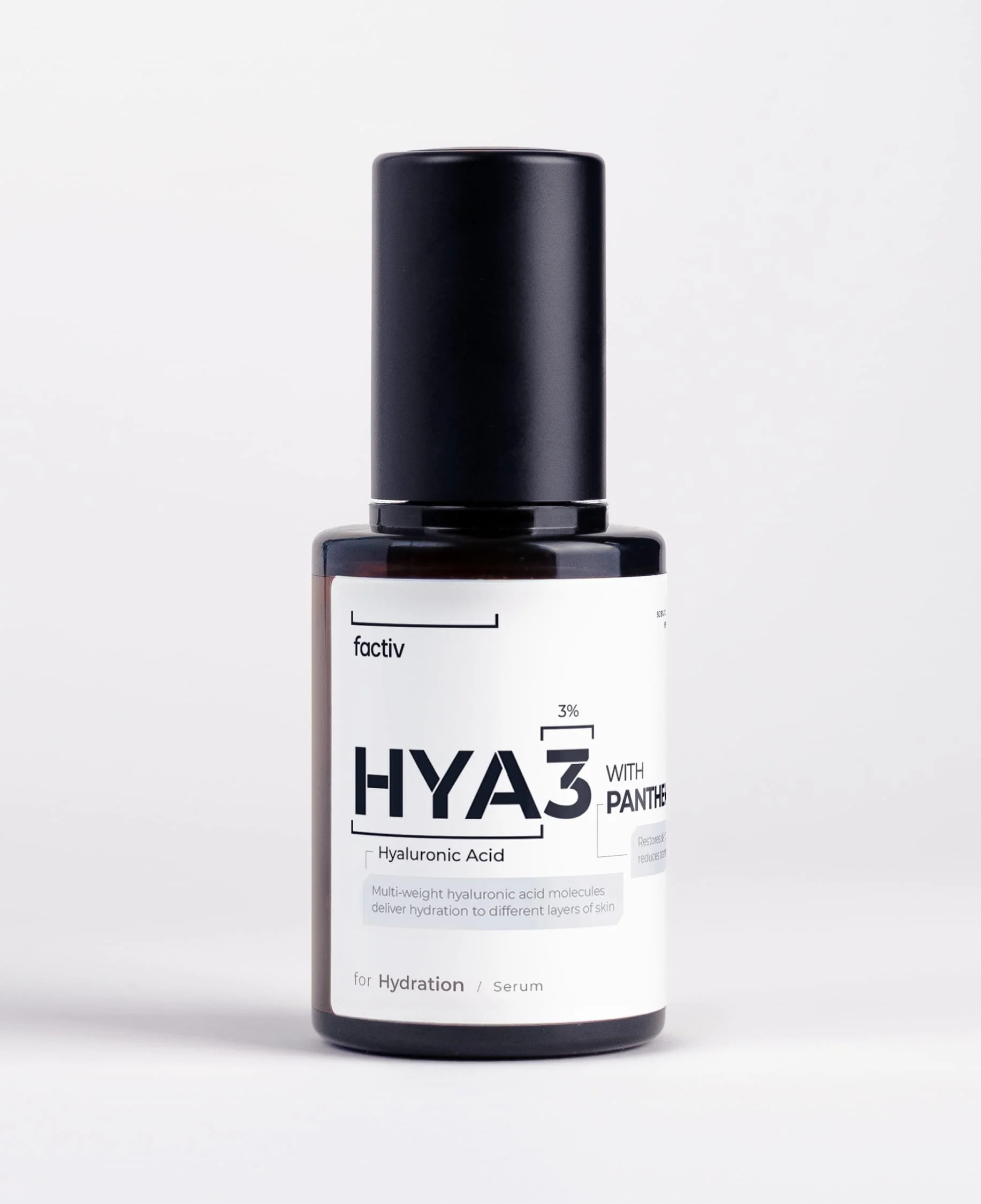
In pursuit of being more environmentally friendly, Factiv decided to forego outer boxes, necessitating all information to be concentrated onto one single label. This challenge was then compounded by the brand’s goal to also detail the effects of each key ingredient to increase transparency. To meet this information-dense requirement while maintaining a clean art direction, I went for a grid-based layout to structure content clearly and hierarchically, ensuring effective communication without decorative extras.
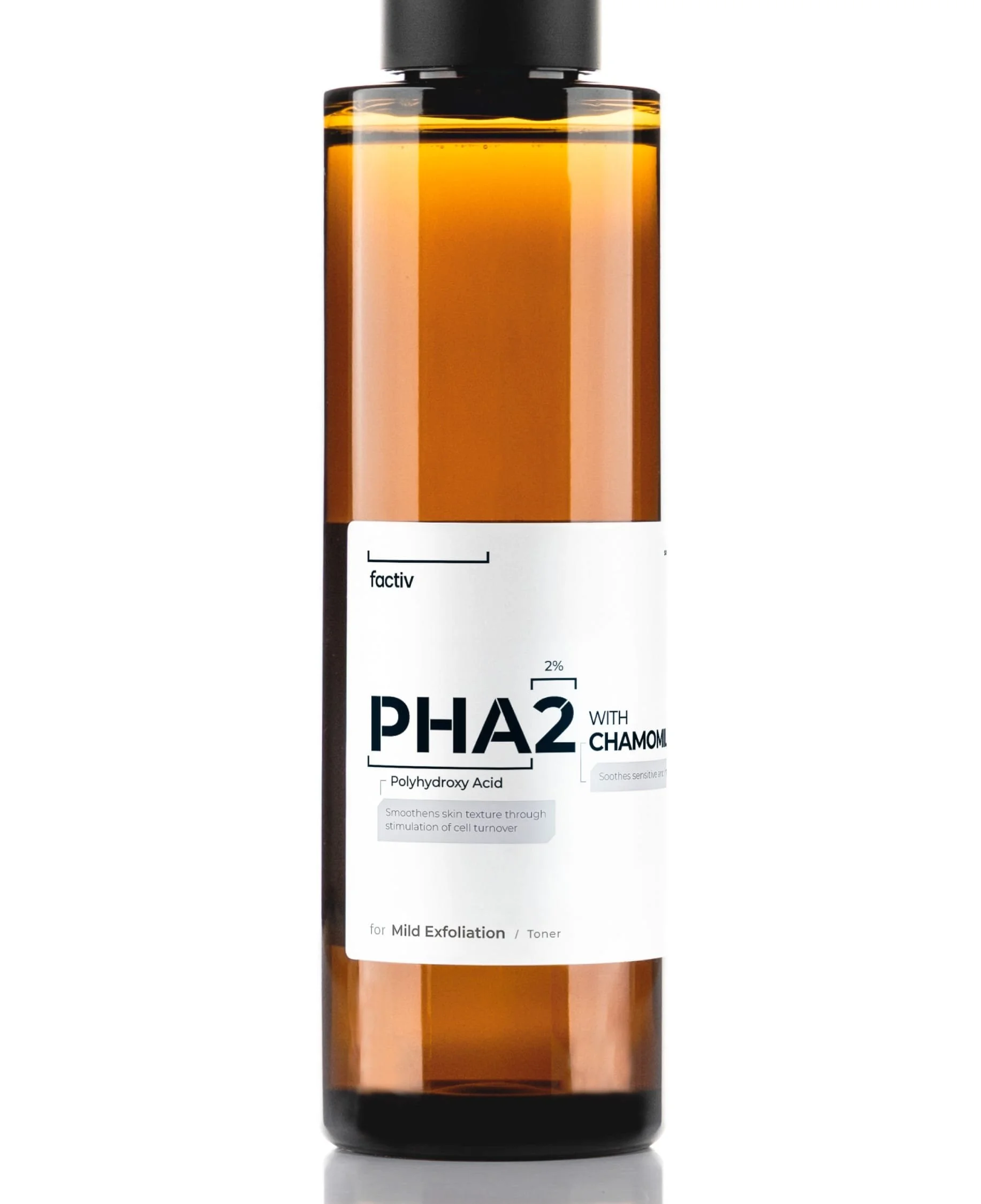
Black, White and Metallic

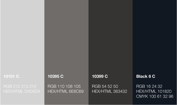
While utilising a black, white and greyscale colour palette to embody the brand’s utility and neutrality, I specifically introduced a metallic silver-grey spot colour to the label printing to add a futuristic touch, enhancing the packaging’s premium appearance.

Primary Visual Element

The primary visual element, an upward square bracket ( ⎵ ), was developed to evoke scientific precision by drawing reference from glyphs used in chemical formulas. It serves as a focal point on the label, guiding viewers to the most crucial product information, and was further incorporated into brand’s logo, symbolising factiv’s effort to make scientific knowledge more accessible to the public.

Unified Visual Identity

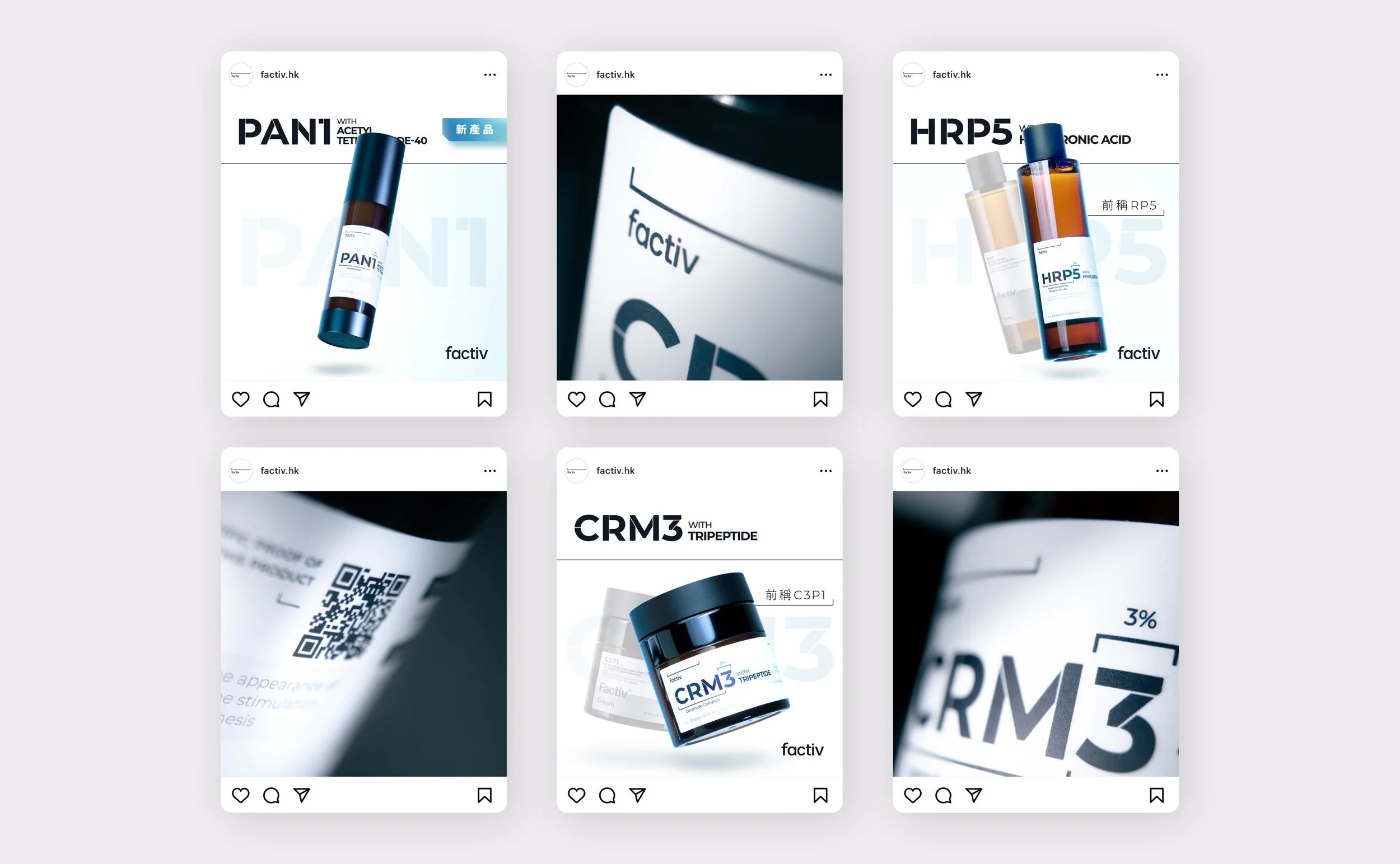
The above design decisions were harmoniously integrated to establish a unified visual identity capable of evolving and adapting across different formats, such as social media and OOH billboards, effectively positioning the brand with a solid image of science foundation and sophistication, and ultimately elevating its recognition in the market.

Evolving with New Products

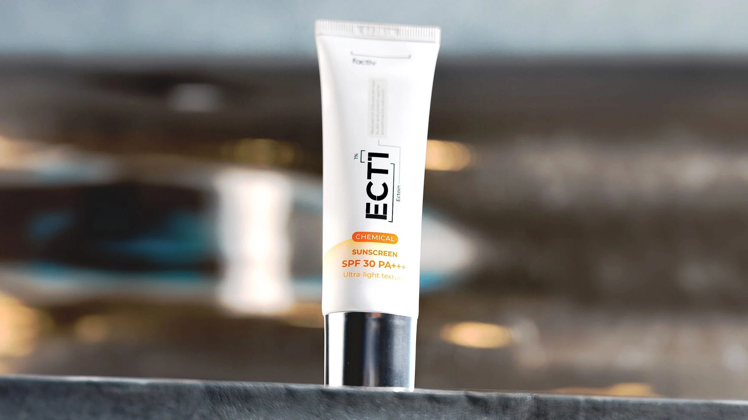
As the product range expands with the addition of an eye gel and sunscreen, the packaging design language has evolved to highlight their distinct new qualities while staying consistent with the clean aesthetic of the core product line. These designs of new products, which are tube-based, reflect both product innovation and continuity in the brand’s visual identity.

The eye gel is housed in a sleek and glossy silver tube to emphasise its premium positioning. For the sunscreen, an orange halo was introduced over the familiar clean layout, symbolising protection against the sun while also offering a refreshing touch. These updates honour the brand’s clean and functional visual foundation while marking its ongoing evolution with the launch of new products. 

Next
Next

Tram Wrap | Billboard | Direct Mail Design for Branding Campaign - Factiv