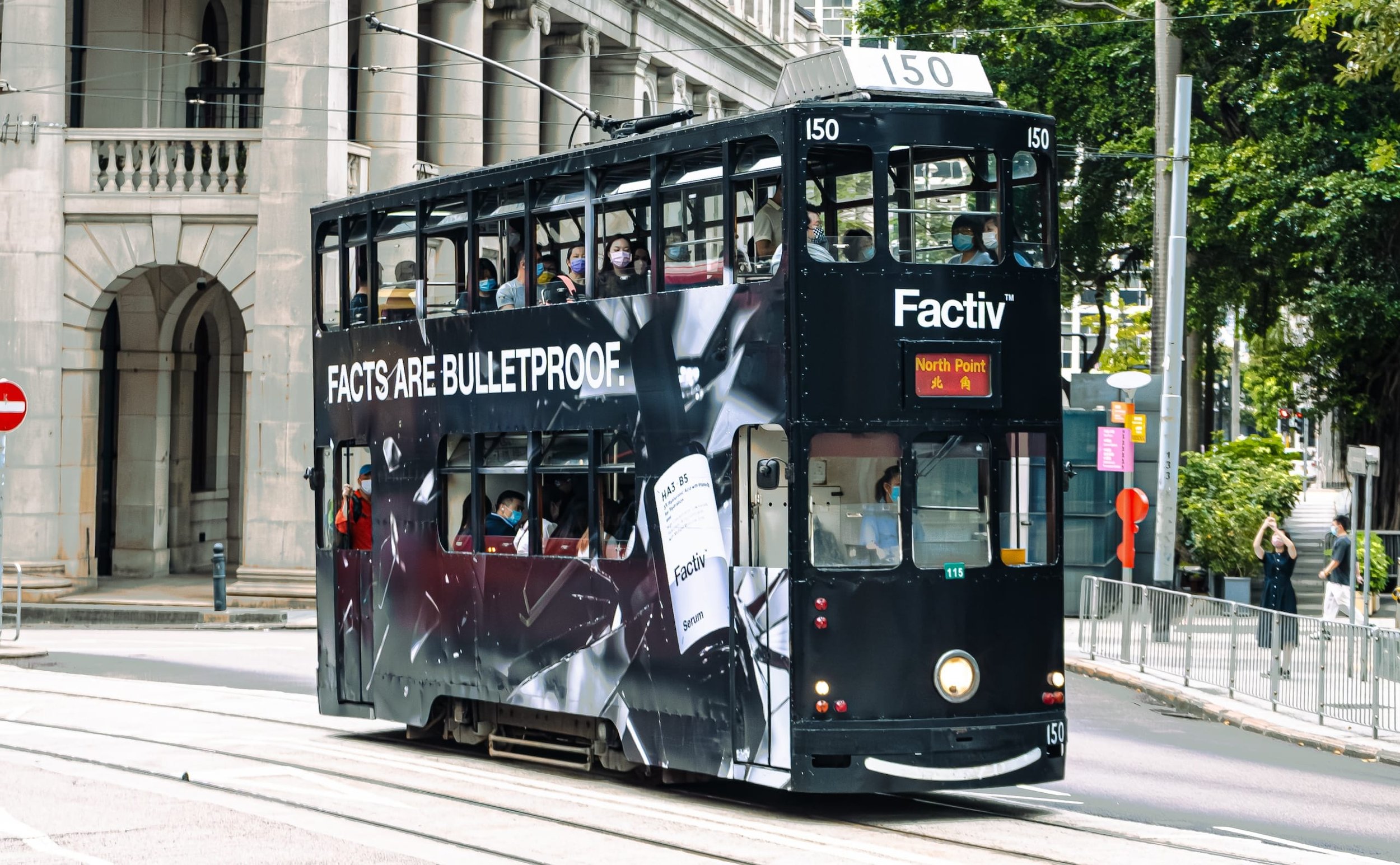
Tram Wrap Design
for Brand Awareness Campaign - Factiv
Expertises
Out-of-Home Advertising
Brand Identity
Art Direction & Conceptual Strategy
Print Design
Background
Factiv is a Hong Kong-based skincare brand that deeply values scientific facts in its formulations, ensuring each product delivers verifiable and effective results that withstand any scrutiny, setting a trustworthy standard against the over-exaggerated claims prevalent in the market.
Challenge
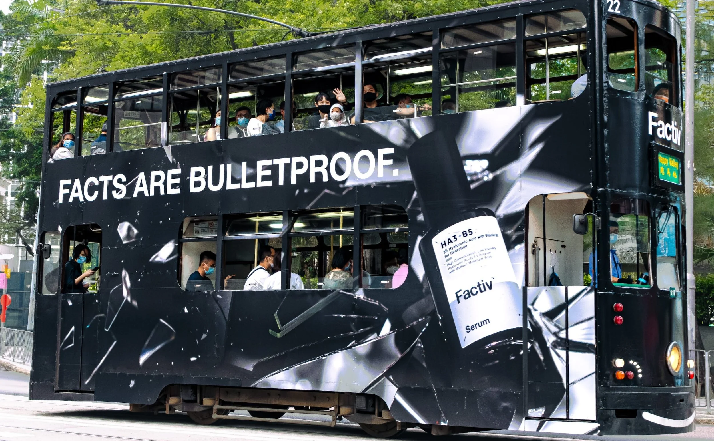
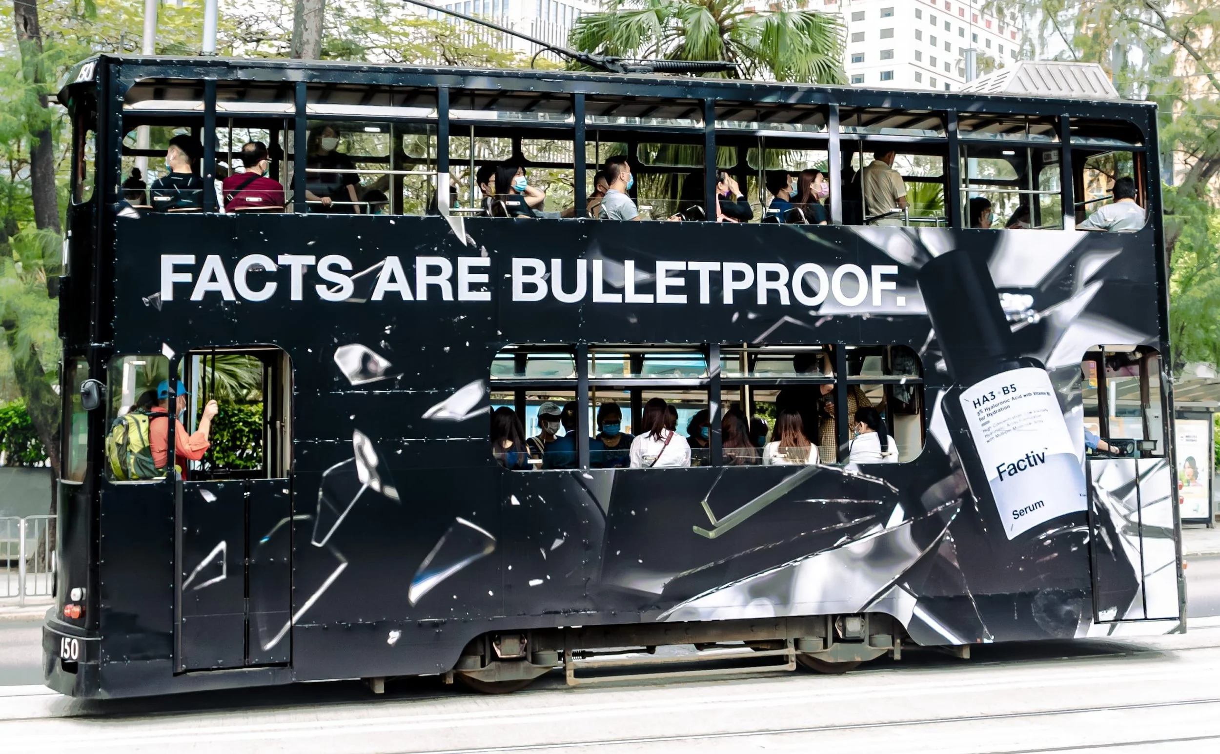
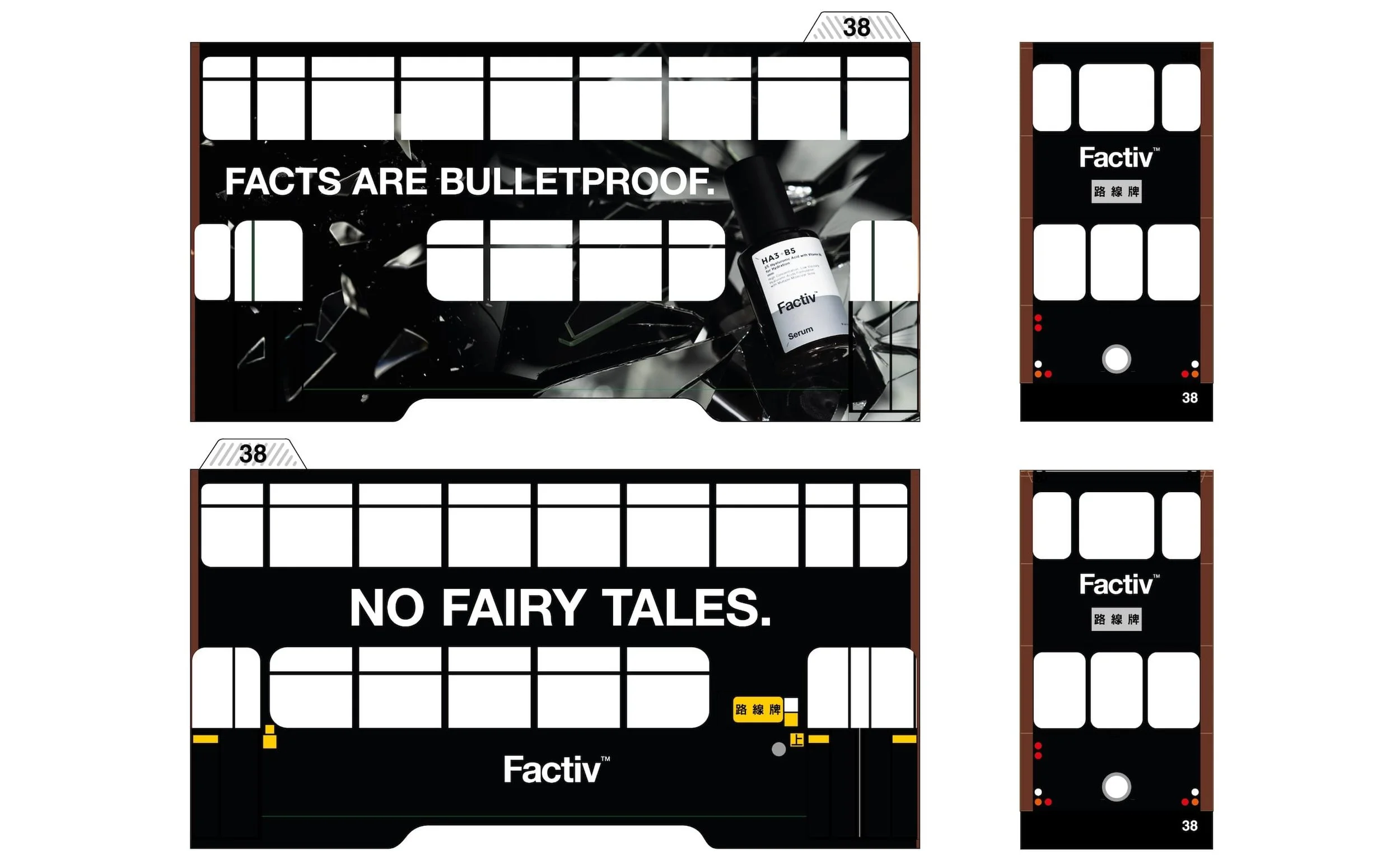
Amid the COVID-19 crisis and social unrest, Factiv witnessed a surge in fear-driven misinformation in the city, resembling the deceptive advertising tactics in the industry that exploit consumer impulsiveness. Factiv seized this opportunity to launch its first physical branding campaign, aiming to advocate for factual information over illusive narratives and also establish a strong, clear fact-based identity distinct from commercially driven competitors. I was tasked with conceptualising and creating the key visual and tram wrap design for this ambitious campaign.
Solution
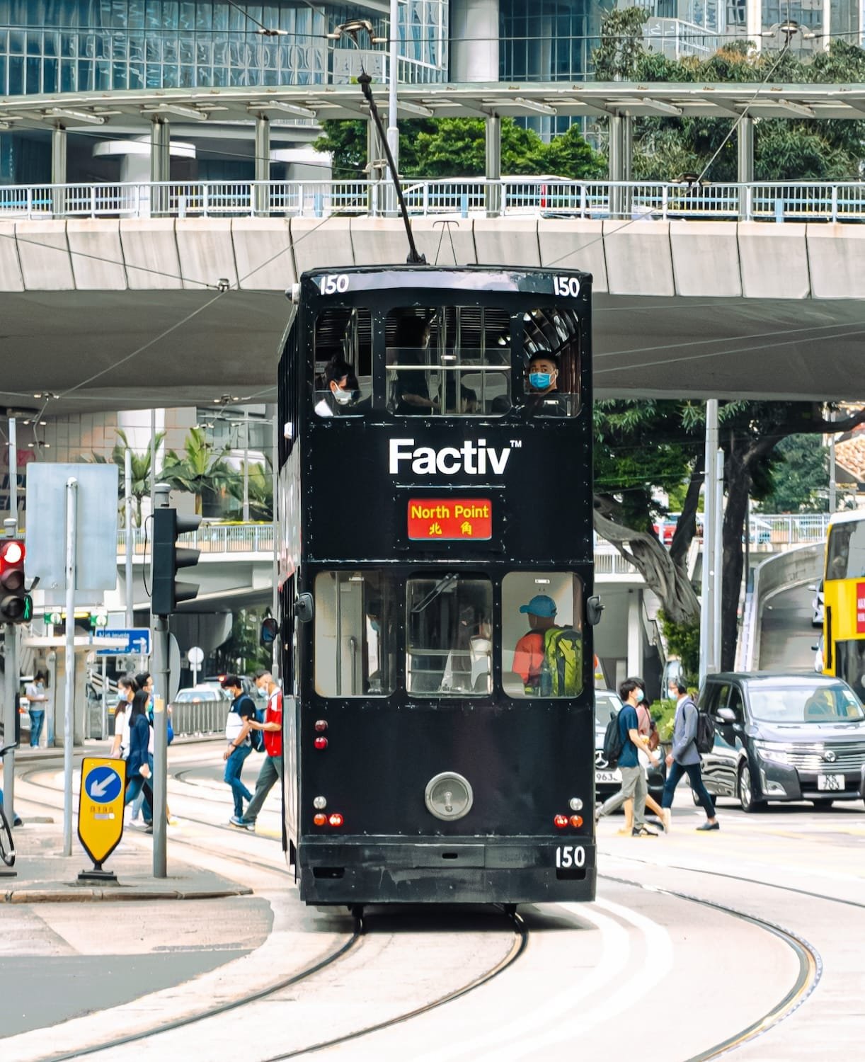
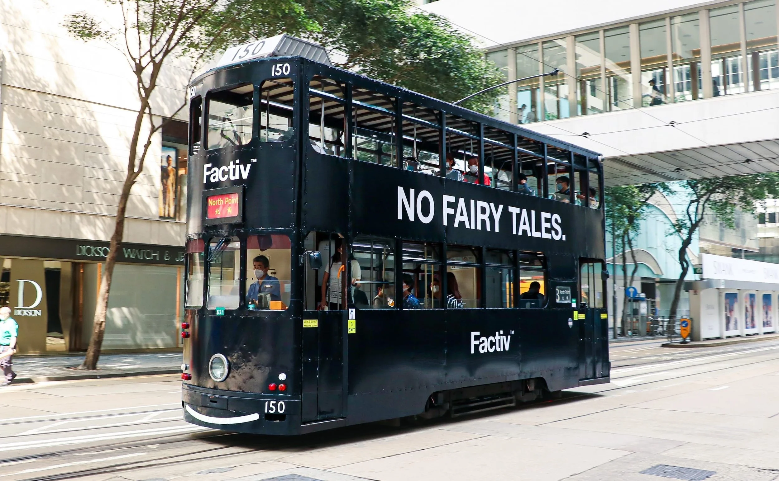
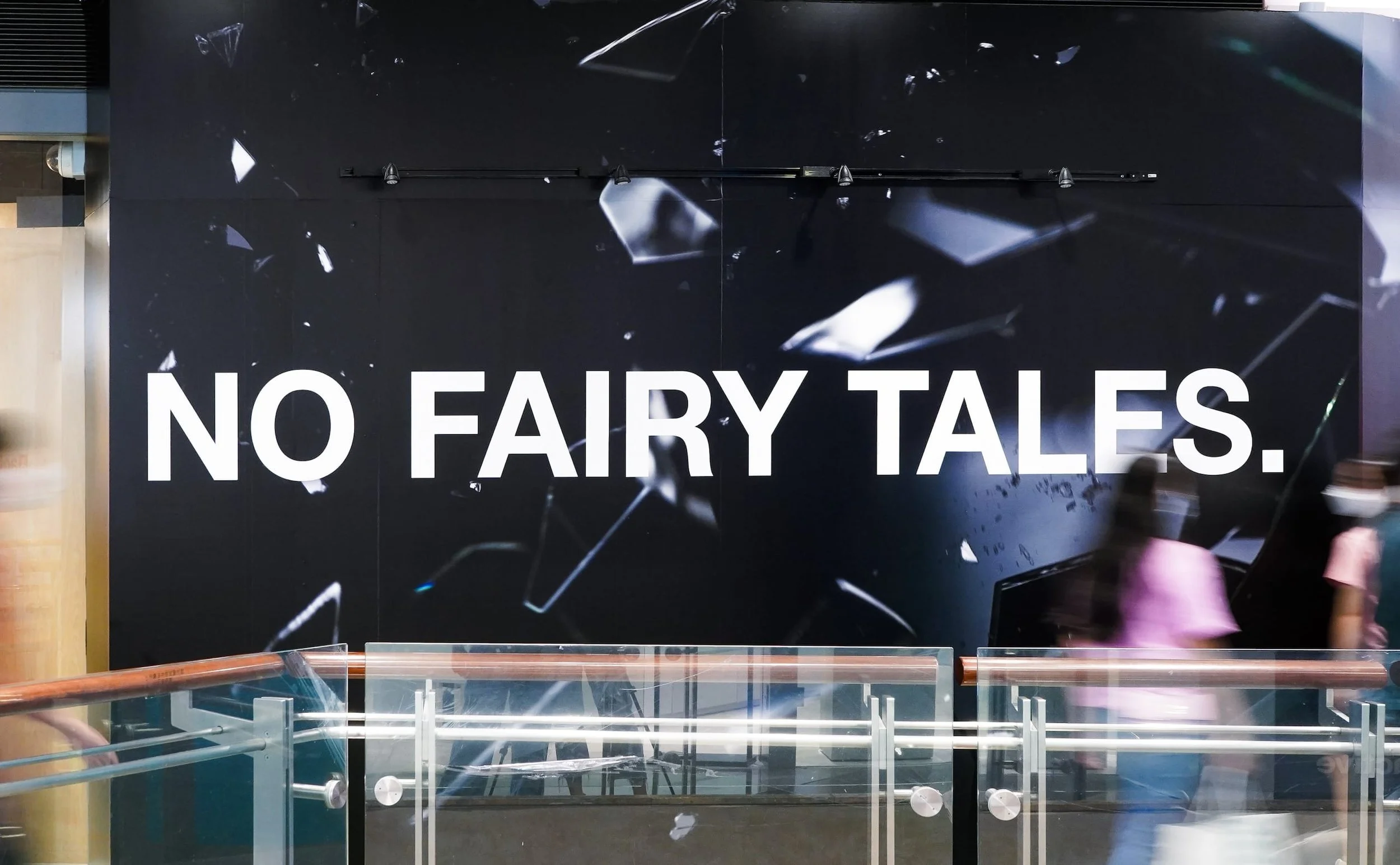
To achieve these objectives, I created a visual that prominently portrays the brand’s skincare product as an indestructible emblem of facts shattering deceptive mirrors, accompanied by the slogan ‘Facts are Bulletproof.’ The design was to reassure the audience that facts remain unaltered despite any distortions, much like the evidence-based products counteracting competitors’ extravagant promises. The tram wrap design was crafted to be striking, contrasting sharply with Hong Kong’s bustling streets filled with flashy ads and fancy shops, reinforcing the brand’s bold stance and pragmatic image while sparking curiosity and encouraging the audience to explore more about the brand. The campaign proved hugely successful, evidenced by widespread recognition and positive feedback across social media, and a substantial increase in online retail traffic and sales.
Wide-Ranging Adaptations
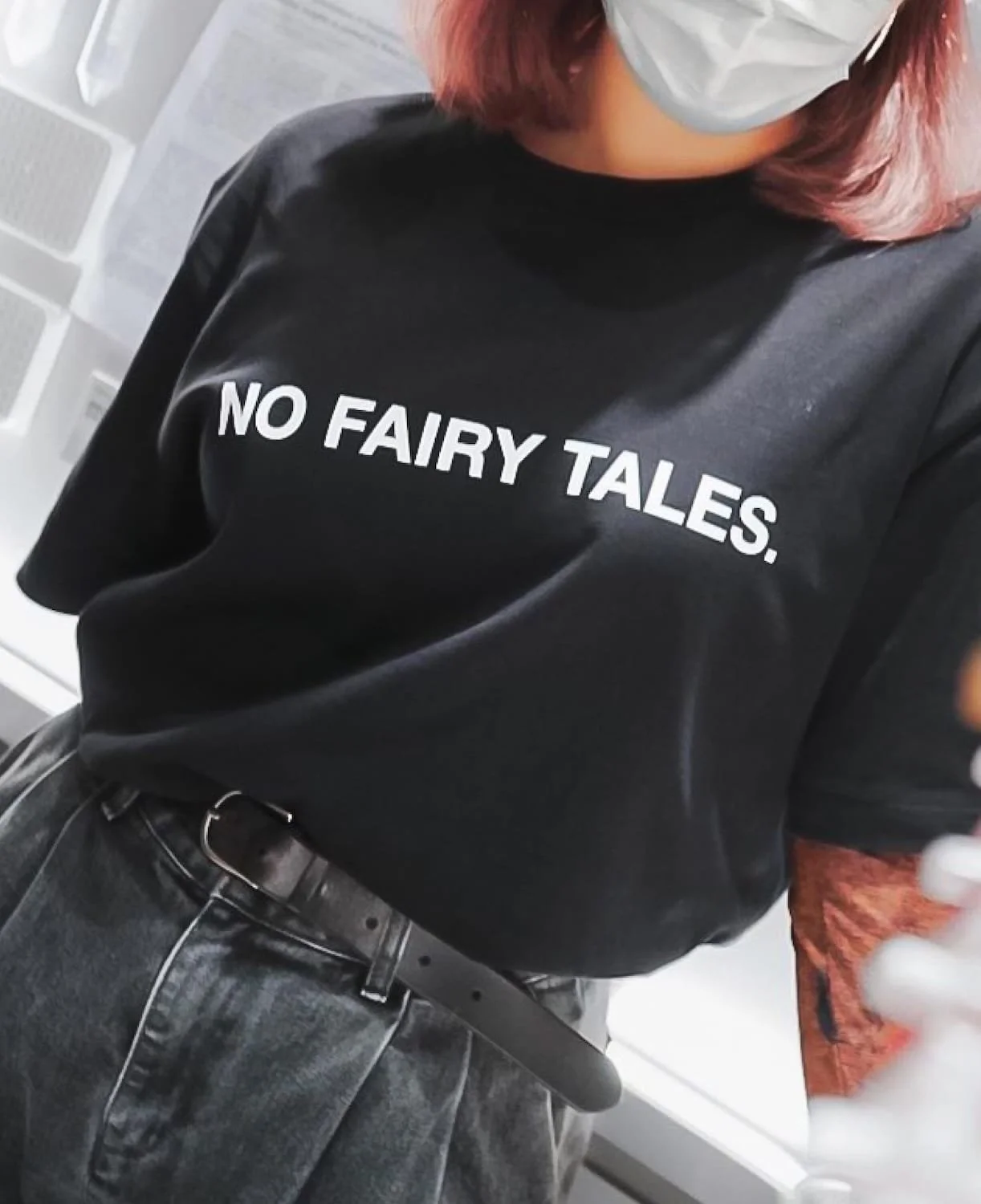
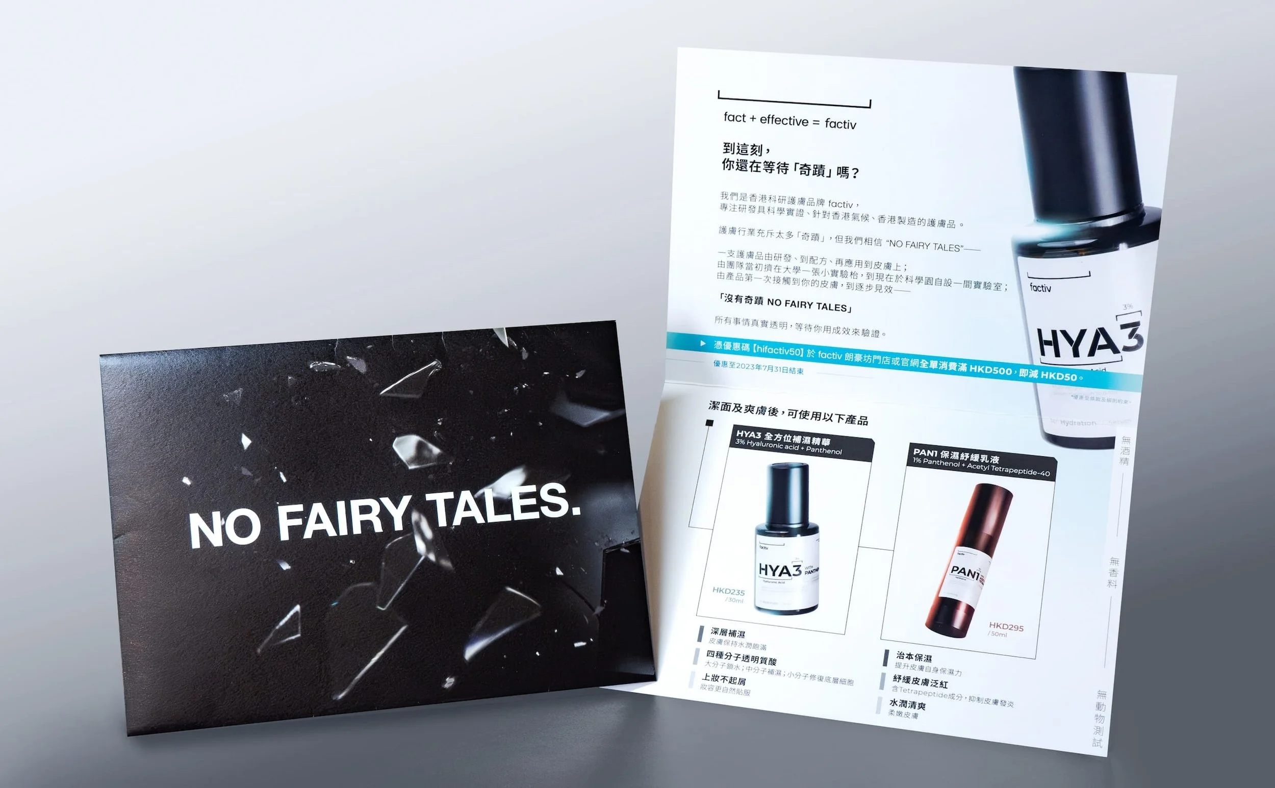
The key visual was widely adapted into multiple formats, from retail hoarding advertisements for upcoming stores in shopping malls to direct mail envelope covers, enhancing brand visibility and increasing potential customer interest.
Design Process
