Key Visuals Design for New Product Launch - Factiv
Expertises
Digital Design
Art Direction & Conceptual Strategy
Photo Editing & Manipulation
Background
Science-based skincare brand Factiv has been dedicated to utilising advanced technology to develop effective and proven skincare solutions. In 2022, Factiv introduced its highly anticipated first cleansing product, ‘CAT1’, a soothing, non-foaming facial cleanser powered by Cationic Moisturising Technology, which leverages positively charged ions. This innovative technology helps retain the skin’s natural moisture, ensuring softness and smoothness while effectively removing impurities, making it ideal for daily use and suitable for all skin types.
Challenge
To counter the common misbelief that effective cleansers must compromise moisture retention and be harsher on the skin, Factiv sought to create compelling visual narratives to illustrate the effective yet gentle cleansing enabled by CAT1’s pioneering technology, allowing consumers to quickly understand its three primary benefits and anticipate an exceptionally comfortable product experience.
Solution
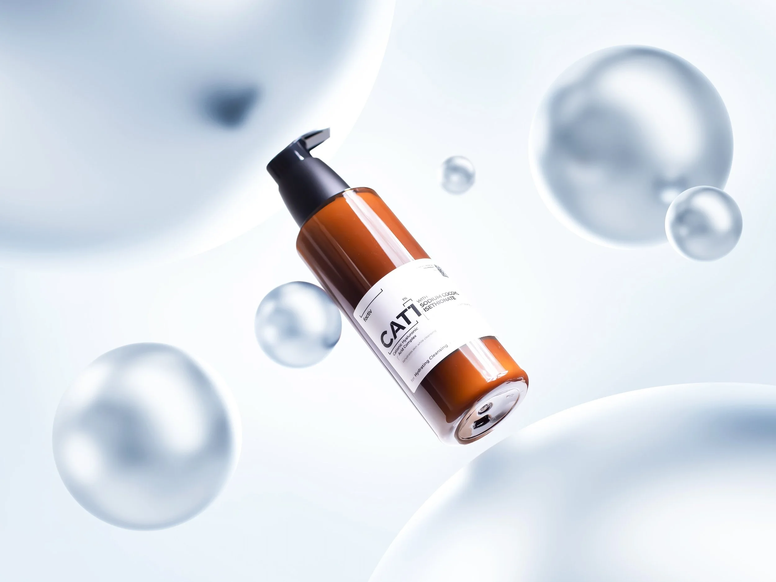
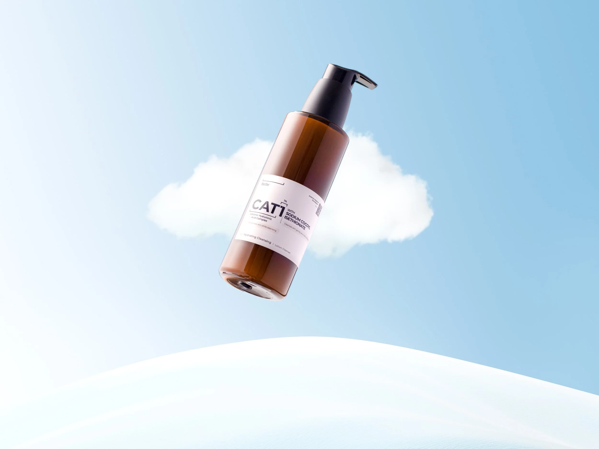
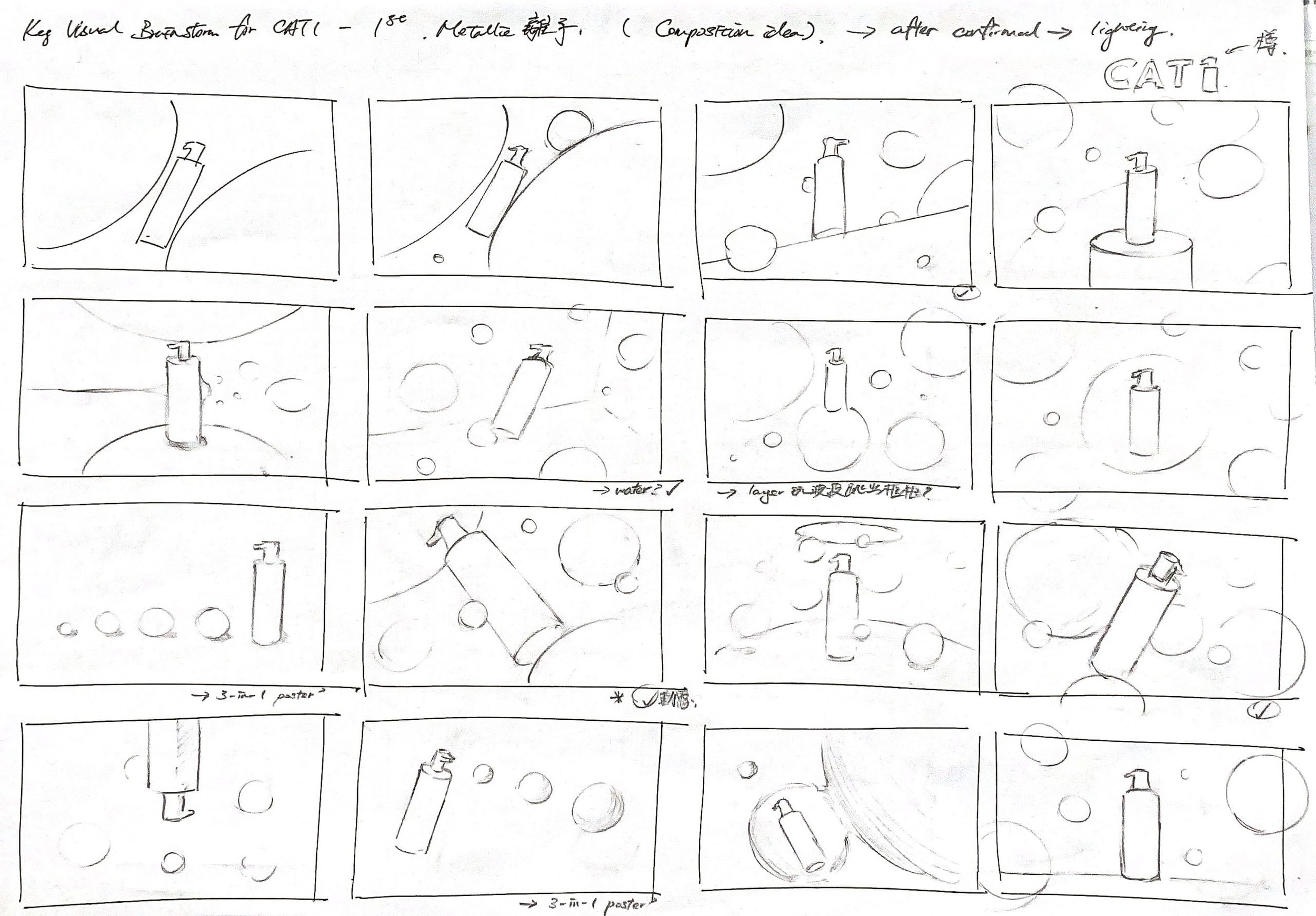
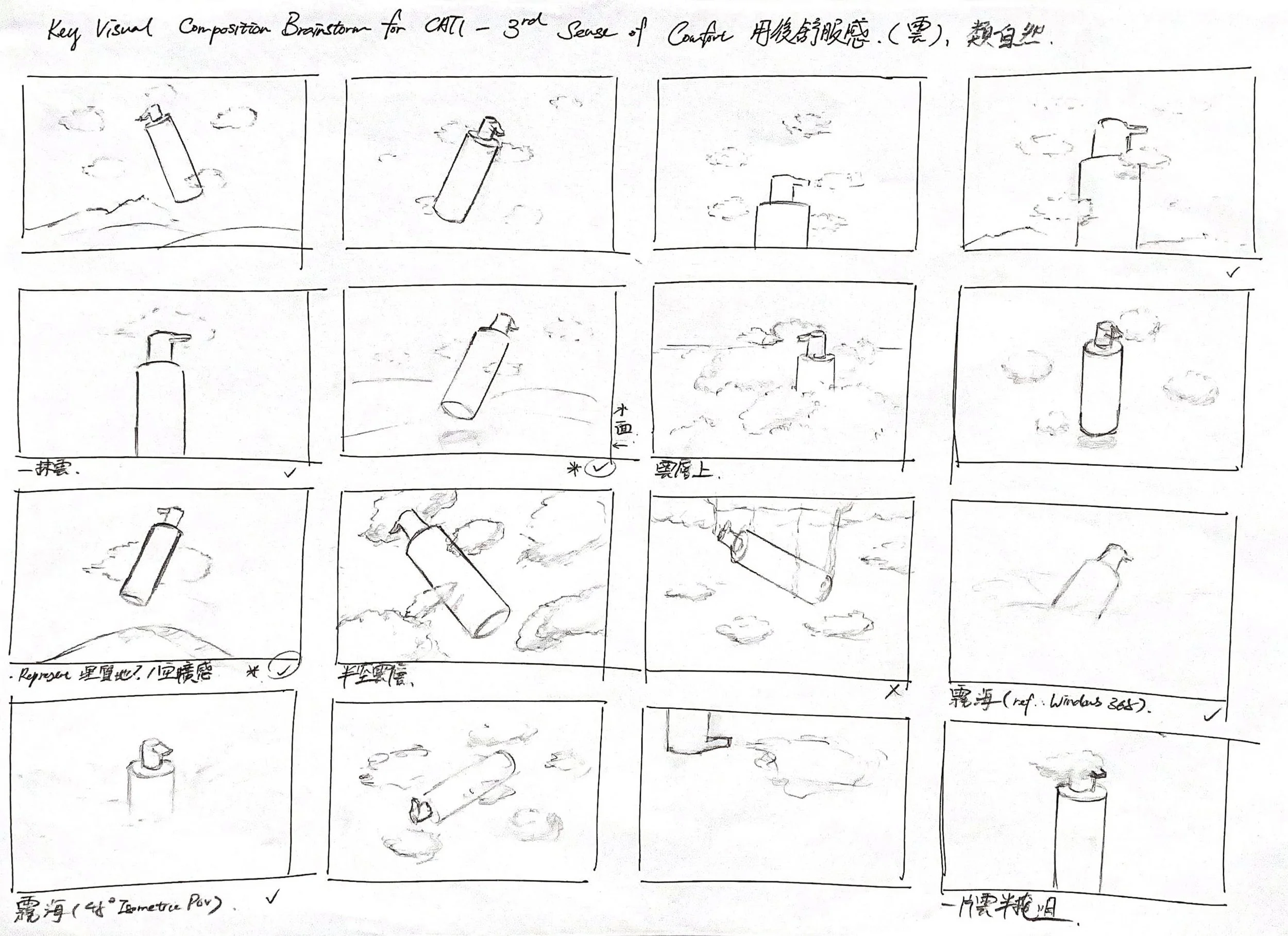
To develop the visuals, I began by conceptualising symbols: metallic spheres, colourful droplets, and white clouds, to represent the product’s ion-powered technology and attributes of moisture retention and softness. Proceeding with sketching, I explored a diverse range of compositions and viewing angles, aiming to seamlessly integrate these symbols with the product in layouts. Simultaneously, I created a digital mock-up to experiment with narrative moods and colour tones, ensuring clear communication when directing the photographer and 3D modeller in subsequent stages.
After finalising the compositions and capturing product shots from selected angles, I worked closely with the 3D modeller, refining texture rendering through multiple iterations to achieve the desired effect. Finally, I integrated all the components, retouching product shots, meticulously positioning each rendered element, and calibrating lighting and colours tones to create cohesive and impactful presentations that convey the intended sensation delivered by the product—a blend of ultimate comfort and technological novelty.
In illustrating the ion-powered technology, I chose metallic spheres with a subtle matte finish, enhanced by a light blue-silver hue and bright backlighting, to achieve a perfect blend of innovation and comfort.
Levitating and bouncing droplets, enriched with a vivid cyan-blue hue, were arranged around the product to evoke a sense of moisturising. Different levels of blur were carefully applied to them to simulate a shallow depth of field, making the composition far more dynamic and refreshing.
To effectively visualise the ultimate smoothness provided by the product, this composition aims to connect the sensation to the tranquillity of gazing at a cloud floating in the sky. The textures of the light blue sky and hill were fine-tuned to appear as smooth as silk, amplifying the soothing experience.
Composition
Drafts
Photo Editing
Process
Key Visual 1
(metallic):
Social Media
Materials
Key Visual 3
(cloud):
In addition to the key visuals, I developed a series of social media marketing materials to further support the product launch campaign. From product sneak peeks to texture displays, all materials consistently follow the soft blue hue colour theme, ensuring a unified visual direction that vividly highlights the cleansing product’s ultra-comfort and moisturising qualities.


